AgGrid Table
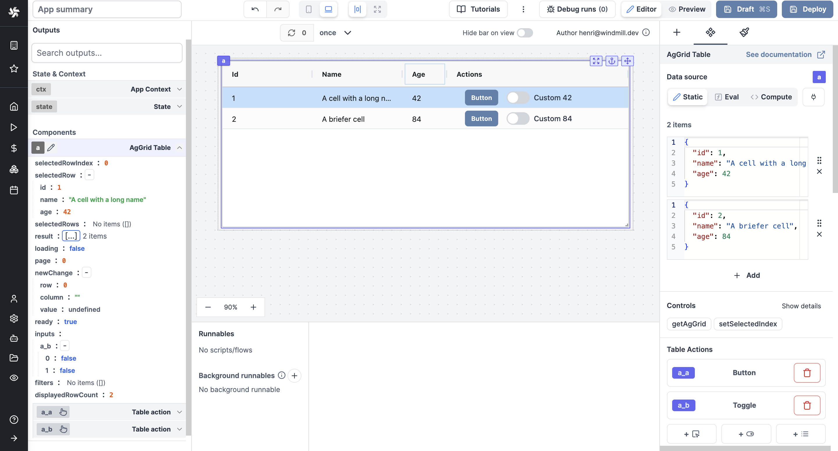
The AgGrid table component allows you to display an Ag Grid table.
If you are new to Ag Grid, check out our Introduction guide.
The following section details AgGrid Table component's specific settings. For more details on the App Editor, check the dedicated documentation or the App Editor Quickstart:
AgGird Table input
| Type | Connectable | Templatable | Default | Description |
|---|---|---|---|---|
Array<Object> | true | false | The table data. |
The array can be static (hardcoded) or dynamic through an eval function or a compute (inline script).
Example of static input:
[
	{
		"id": 1,
		"name": "John Doe",
		"age": 25
	},
	{
		"id": 2,
		"name": "Jane Doe",
		"age": 30
	}
]
Example of compute input:
export async function main() {
	const res = await fetch('https://api.sampleapis.com/recipes/recipes', {
		headers: { 'Content-Type': 'application/json' }
	});
	return res.json();
}
Controls
This component can be controlled by frontend scripts using these functions:
- getAgGrid: Use the
getAgGridfunction to get the ag-grid instance of a table. - setSelectedIndex: Use the
setSelectedIndexfunction to select a row in a table or an AG Grid table.
Table actions
AgGrid Table can define actions that will be displayed in each row of the table. An action is a component that cannot be moved.
Available components are:

AgGrid Table configuration
| Name | Type | Connectable | Templatable | Default | Description |
|---|---|---|---|---|---|
| Column Defs | object | true | false | Id, Name, Age | The definition of the columns & their name. |
| Flex | boolean | false | false | true | Allows you to distribute available space among multiple elements to control their relative sizes and positions. |
| All Editable | boolean | false | false | false | Whether you want all columns to be editable. |
| Multiple Selectable | boolean | false | false | false | Make multiple rows selectable at once. |
| Row Multiselect With Click | boolean | false | false | true | If multiple selectable, allow multiselect with click. |
| Pagination | boolean | false | false | false | Whether you want pages on your table. |
| Select First Row By Default | boolean | false | false | false | Whether you want the first row to be selected by default. |
| Extra Config | object | true | false | {} | Extra configuration for the AgGrid table. |
| Compactness | select | true | false | normal | Change the row height (normal, compact, comfortable). |
| Wrap Actions | boolean | false | false | false | Wrap the actions in the table. |
| Footer | boolean | false | false | false | Show the footer of the table. |
| Custom Actions Header | string | true | false | Custom header for the actions. |
Outputs
| Name | Type | Description |
|---|---|---|
| result | object | The AgGrid table data. |
| loading | boolean | The loading state of the AgGrid table component |
| selectedRow | object | The selected row |
| selectedRowIndex | number | The selected row index |
| selectedRows | array | The selected rows |
| page | number | The current page |
| newChanges | object | The latest updated row |
| ready | boolean | The AgGrid table component is ready |
| inputs | object | The outputs of each action organised by action id and array of outputs |
| filters | object | The filters applied to the table |
| displayRowCount | number | The number of rows displayed on the table |
Column Defs
The Column Defs input allows you to define the columns of the table. The columns are defined as an array of objects, where each object represents a column. The object has the following properties:
| Name | Type | Description |
|---|---|---|
| field | string | The name of the field to display. |
| headerName | string | The name to display (if different from the name of field). |
| editable | boolean | Whether the column values can be edited by user. |
| minWidth | number | The minimum width of the column. |
| flex | number | Dynamically allocates remaining space of column based on its flex values. |
| hide | boolean | Whether the column is hidden. |
| valueFormatter | string | The function to format the value of the column (Currencies, Date, Percentage, Uppercase etc.) |
| sort | string | The order of the column (asc or desc). |
| filter | boolean | Whether the values of column can be filtered. |
| cellRendererType | string | The type of cell renderer to use (link, image, button etc.) |
AgGrid Infinite Table
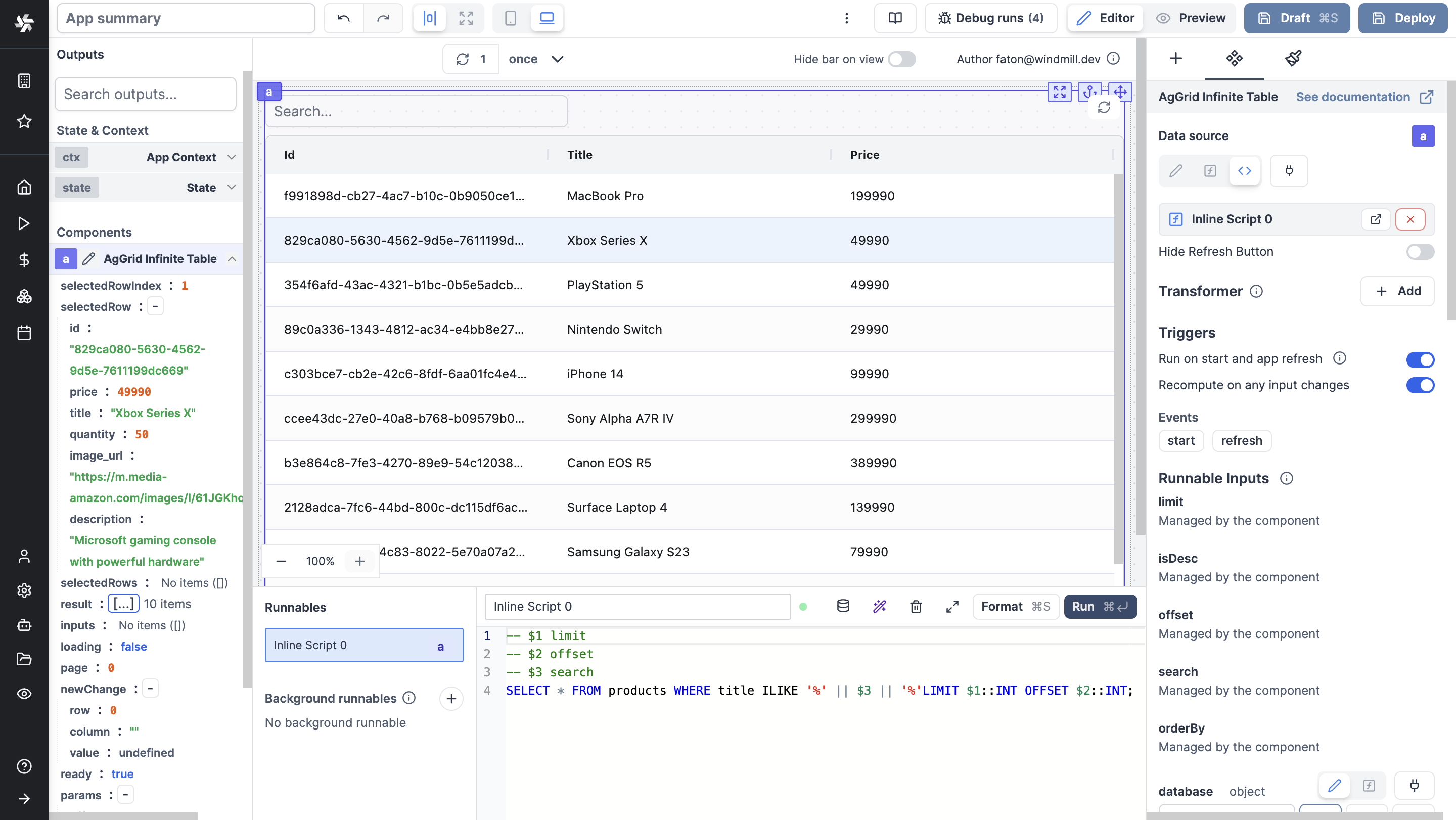
The AgGrid Infinite Table component allows you to display an Ag Grid table with infinite scrolling.
With this SQL syntax, you can create a query that fetches data from the database and lets the component manage:
limit: Specifies the number of rows to display on a single page or to fetch from the server in one go (here, infinite).isDesc: Specifies the order of the rows (ascending or descending).offset: Specifies the number of rows to skip before starting to return rows.search: A search bar added to the component.orderBy: Specifies the column by which the data should be sorted.
-- $1 limit
-- $2 offset
-- $3 search
SELECT * FROM products WHERE title ILIKE '%' || $3 || '%'LIMIT $1::INT OFFSET $2::INT;

AgGrid Infinite EE
The AgGrid Infinite EE component allows you to display an Ag Grid table with infinite scrolling and the rest of AgGrid Enterprise features.